In this article, we are going to go over the core principles for introducing more interactions and animations into your websites in order to make them more engaging and above all, user friendly. We’ll cover.
- How to navigate budget/time constraints
- The different levels (types) of interactions
- The 5 elements of interaction design
- Easing and parallax
- What tools you can use to create web interactions to speed up your process while creating high-quality websites
Something we’re getting asked more of and is becoming a staple in modern web design is animations. This doesn’t necessarily mean flashy animations or portals to other dimensions. Interactions and animations can be very powerful in giving users a sense of where they are by conveying meaning and purpose but they also make for an engaging and memorable experience. As we move into different mediums like AR or VR being able to understand animation and use it as an effective communication tool will no doubt allow you to stand out in being a Full Stack Agency.
While many resources exist online, I felt as though they focus on the (almost) limitless potential of on-device or native products. In this article, we’ll focus more on websites.
It’s important to state that the mindset needed for interaction design should be fundamentally rooted in the user and their goals. Without this, a design can end up being a confusing mess. This also means that animations should reinforce the design and branding.
It’s important to state that the mindset needed for interaction design should be fundamentally rooted in the user and their goals. Without this, a design can end up being a confusing mess. This also means that animations should reinforce the design and branding.
Then there are the technical abilities of the dev team to be able to turn beautiful animations into code and this is where there’s potentially going to be some friction between them and designers. My advice here is for designers to approach things unrestricted and push the boundaries while fostering a healthy relationship by accepting compromise if a developer says it cannot be done (or that they cannot do it).
There are some approaches to how in-depth you go with animations that also serve to form the basis of their purpose. These levels build on one another which can help prioritise as more time and budget become available.
Level 1: Functional Animations
Functional animations include things like hover and focus animations, modals and menus moving on and off the screen. They generally focus on user feedback to enhance the user experience and communicate cause and effect through animation.
These give the website a natural and fluid feel while maintaining fairly low overheads. At the very least our applications and websites should include these micro-interactions we call “functional interactions”.
Level 2: Structural Motion
Types of structural motion include; elements and things moving on and off the page, navigation between pages and transitions or animations that involve the choreography of multiple elements.
Structural animations sometimes involve multiple elements on the site moving together in synchronicity. These start to become costly to implement but done well, can drive the UX of the site by making it clear what is happening, why.
Structural motion should build on that cause and effect aspect while also giving a user a sense of where they are. This helps reduce cognitive load on a user trying to work out what just happened or is happening.
Using structural animation to give feedback can help reduce something called “change blindness”. That is when something changes but the user is unaware.
We can also use animations to subtly (or not so subtly) draw their attention to something. Again, being respectful of the user should be used tastefully implemented. A user can “learn” the UI with better feedback or direction.
Notice how attention is drawn to the header image by fading out the information and bringing it back in once we’ve navigated.

Level 3: Emotional animation
Finally, emotional animations can be things like parallax and small interactive or highly detailed animations which don’t really serve much of a purpose other than to delight. These types of animations could be considered optional in that they aim to delight and convey emotion, drama and suspense (more on that later).
When used sparingly emotional animations can take a website to the next level. Emotional animations can be cleverly used to tell a “story” and in these instances, It serves a key purpose in conveying the brand of the website owner.
Animation Elements
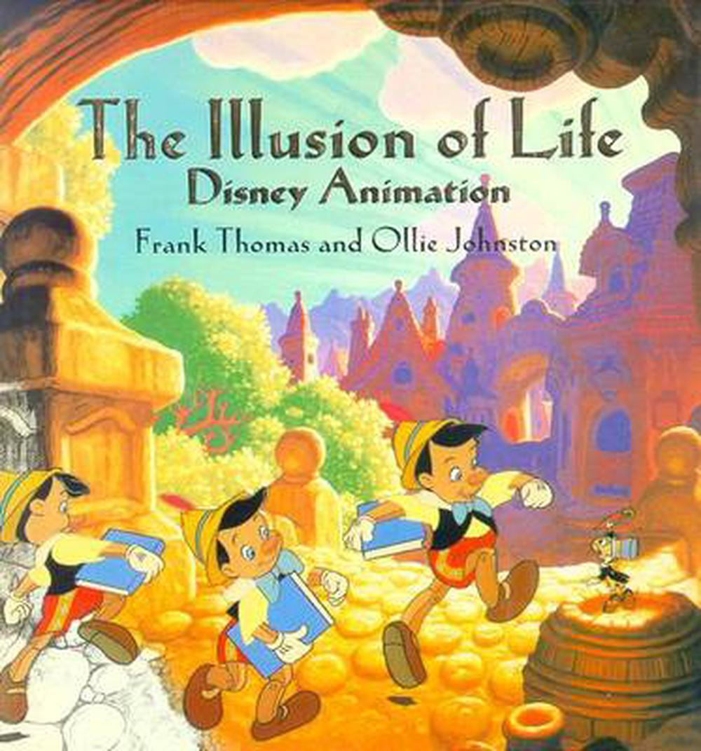
The elements of website animations are; trigger (what causes the animation), response (the actual animation itself), timing (how long it takes), delay (how long it takes to start), easing (the physics). These are broadly taken from the book The Illusion of Life: Disney Animation and the twelve basic principles of animation. Although Issara Willenskomer argues against this parallel in his article “UI Animation Principles: Disney is Dead”. In short, Disney animations focus on less-functional applications of animation. For a more practical look at this distinction, read Disney’s Motion Principles in Designing Interface Animations. In this section, we’ll go over some of the most immediate principles to get you going.
Digging into the details a little, if we take a look at timings – when we talk about timings with regards to functional animation – these should be short. Consider them as micro-interactions that should last no longer than 300ms. Because functional animations should be commonplace in an app or website we want it to feel snappy and so anything longer will make the website feel sluggish. This should all take into consideration the actual distance the animation is traversing and the size of the object that is being animated. The larger the distance, the more time it should take. When we consider emotional animations, long and drawn out sequences can add drama while creating impact and emphasising the story aspect to the website. Structural motion animations should have a blend of the two and should, once again, consider the brand. Bigger screens tend to
Delay can help create suspense when telling a story but also when choreographing multiple elements, staggering elements, that is, increasing the delay in a ‘follow’ element can help add that sense of the relationship between a ‘lead and follow’ sequence animation. Collisions between elements can also help create smoother more satisfying animations. Things aren’t staggered in perfect intervals, they wait for a nearby element to come into contact with before continuing its own animation path.
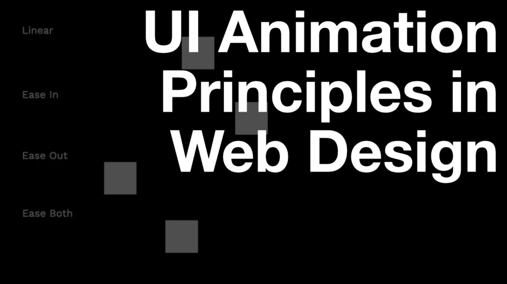
Easing helps merge that blend of the real world as they can emulate physics (gravity, inertia, drag, lift, etc.). The different types of easing are; Linear, ease-in (accelerate), ease-out (decelerate), ease-in-out (accelerate then decelerate), spring/bounce (elastic).
Linear animations tend not to be used as much as it doesn’t feel organic. Things don’t behave in a linear fashion in the real world. Examples though could involve a customised mouse or time-based synchronisation like a progress bar but even these could work well with a bit of easing. Ease-in is primarily used when things enter the screen. Conversely, ease-out is when things exit the viewport. Using Ease in and out together is appropriate when the element stays on the screen like a modal or popup.
As we bring into play multiple elements when using structural animation it’s important that we keep easing timings the same (and maybe play around with delay). Delay or staggered animations can create anticipation and drama but also synchronise the effect elements have on one another to create a sense of cohesion. This is sometimes referred to as ‘offset’.
Considering Scale and Depth (Z Space)
To give a sense of scale and depth there are a few things that can be done to drive this when considering animation. Making an element smaller in relation to other elements can make it look further away. When thinking about motion, things that are further away tend to move slower whereas things that are closer will move fast. Combining this, we can create a parallax effect. Obviously not hard and fast rules but something we can use to guide us.

Creating Your Animations
If you’re looking for inspiration on interactive animations, check out Dribble or the Awwwards website where some of the best interactive websites are showcased. Although I’d suggest immersing yourself in the article titled Creating Usability with Motion (the UX in Motion Manifesto). This article delves into UI animations principles and when and why you might use them to avoid tired tropes we see time and time again for that less well-versed in UI Animation.
Storyboards with timings and other properties can be helpful in communicating animations and interactions to team members and some tools like Keynote even enable basic transitions. In almost all cases it’s more effective to convey animation and interactions using a motion graphics tool like After Effects to tell the story visually. After Effects however doesn’t lend itself well to UI Design as there is no interaction with the output so there may be a disconnect in understanding the cause and effect of a user action.
Tools such as Invision Studio, Principle, Prototpie, Flinto, and Mockitt play nicely with applications like Sketch and Figma and enable user action in order to trigger animations and interactions; however, one thing these tools lack (at this time) is the ability to communicate timing and movement values in the form of code that a tool like Zeplin or Figma (Inspect panel) would. You’ll have to find ways to communicate timings with the team or simply have everyone be able to use and understand the tools themselves so they can find this information out.
Figma is also adding animation functionality at this time. I don’t think it’ll be long before it matches the capabilities of something like Protopie.
If you want to demonstrate animations and interactions that could potentially be usable by the development team, consider using Webflow or Framer X (React Based) but of course, these come with a steeper learning curve and the code you create may not be of the standards the development team has set.
If a highly detailed animation is needed that doesn’t require user interaction (no-realtime interaction) beyond play/pause, you can use a tool developed by Airbnb called Lottie. After Effects is used along with a plugin called Bodymovin. The development team will then use a library called Lottie in order to have this appear like a movie on the website. Lottie files are lightweight and scalable in size which requires little to no development effort once set up. A designer can simply update the Lottie file and replace this to see an updated animation.
For a full list of animation in the context of UX, visit – The ultimate guide to proper use of animation in UX | by Taras Skytskyi | UX Collective (uxdesign.cc)
Some key takeaways
- Use animations tastefully and always consider the user in the brand
- Start with functional interactions and build as budget/time allows
- Trigger, response, delay, timing and easing are the principles of web animation
- Scale and speed can be combined to create depth and parallax
- Use tools like Protopie to prototype interactions and animations and get sign-off before build